Branding

Pangaea was going public and needed a new identity. After hours of research, conversations and sketches, I crafted a "graphic interpretation" of a plimsoll mark. This mark is the loading line on the bow for vessels to use as a safety guide. The logo would be easily scalable and interchangeable with the company's subsidiaries. Classic navy and it's complimentary orange are bold and clean.
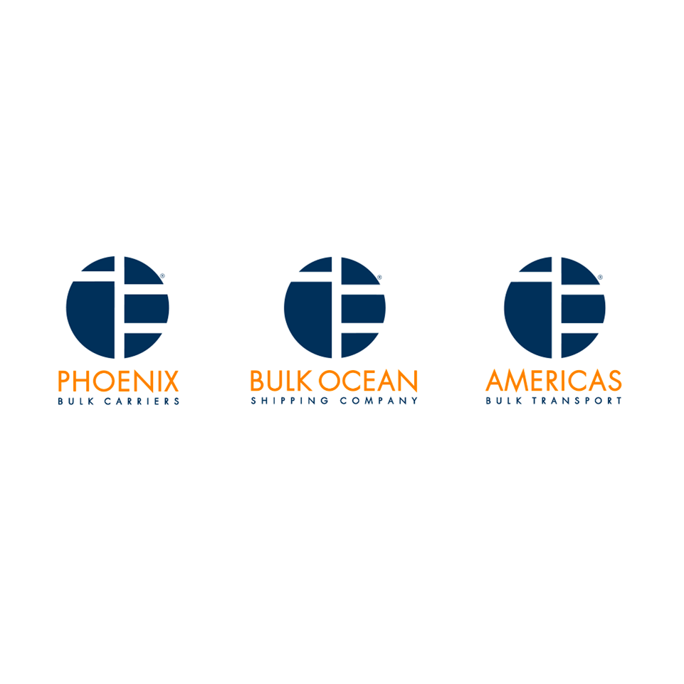
These 3 subs needed to translate with the umbrella logo.

This fun angle for a group photo was intended for the corporate website.
Pangaea was going public and needed a new identity. After hours of research, conversations and sketches, I crafted a "graphic interpretation" of a plimsoll mark. This mark is the loading line on the bow for vessels to use as a safety guide. The logo would be easily scalable and interchangeable with the company's subsidiaries. Classic navy and it's complimentary orange are bold and clean.